


Primary sourcePainting1973
Queen crest
Freddie Mercury · 1973
The band logo designed by Freddie Mercury shortly before Queen's first album was released.
Mercury personally designed this crest, applying his art college training to create Queen's visual identity.

About this source
What it is
The "Queen crest" is the band's logo, designed by Freddie Mercury shortly before the release of Queen's self-titled first album. It combines symbols connected to the zodiac signs of the band's members.
Why it matters
The logo reflects Mercury's training in graphic design and shows how he brought visual creativity, not just music, to shaping the band's identity. It became one of the most recognisable band logos in rock music history, used on album covers and merchandise for decades.
Look closer
- What symbols can you spot, and what might they represent?
- Why might a band want a heraldic-style crest instead of a simple wordmark?
- How does a logo help create a lasting public image for a group of musicians?
This painting is part of the curated material that grounds the AI version of Freddie Mercury on Humy.ai — when students ask about related events, the AI can quote it and cite it.
More Freddie Mercury sources
Browse all 47 →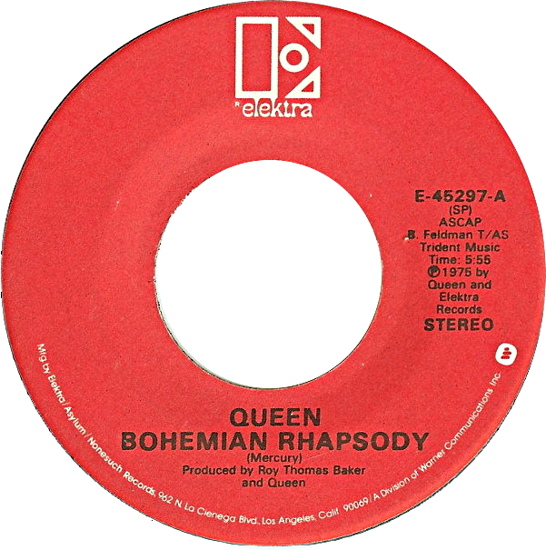 Artifact
Primary source
Bohemian Rhapsody
Freddie Mercury · 1975
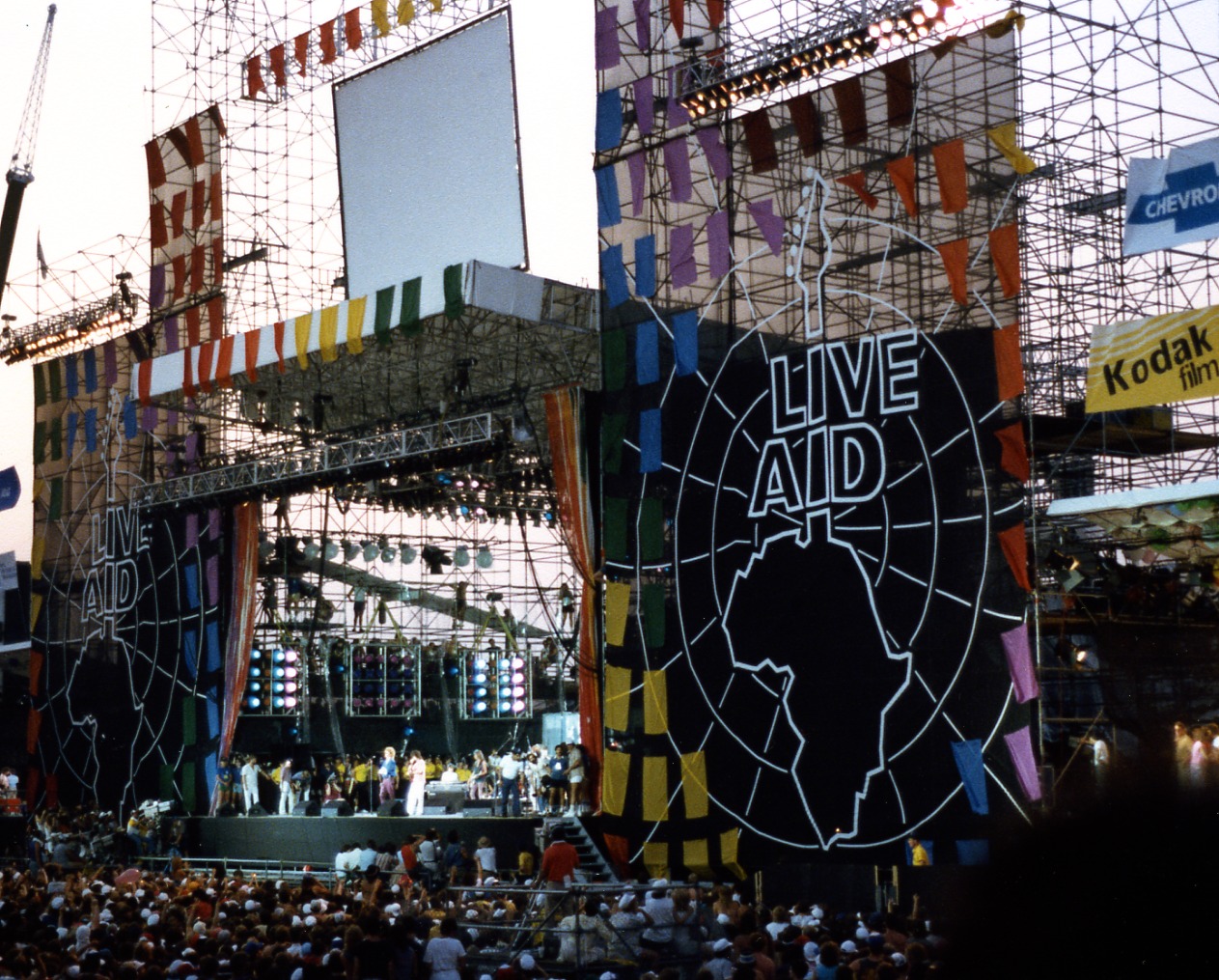 Documentary
Primary source
Live Aid
13 July 1985
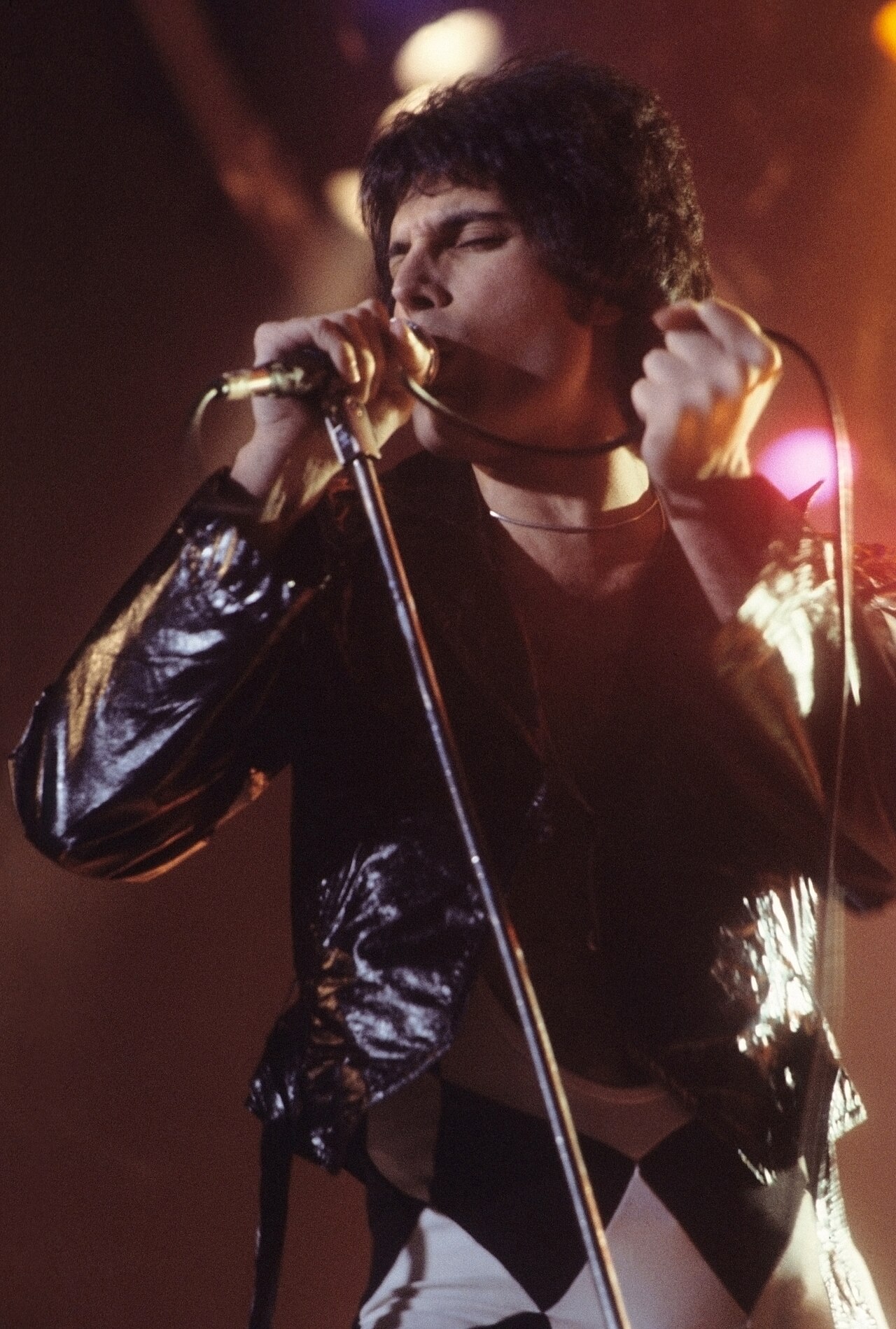
 Photograph
Primary source
Freddie Mercury 1975 Elektra publicity photo
Koh Hasebe · 1975
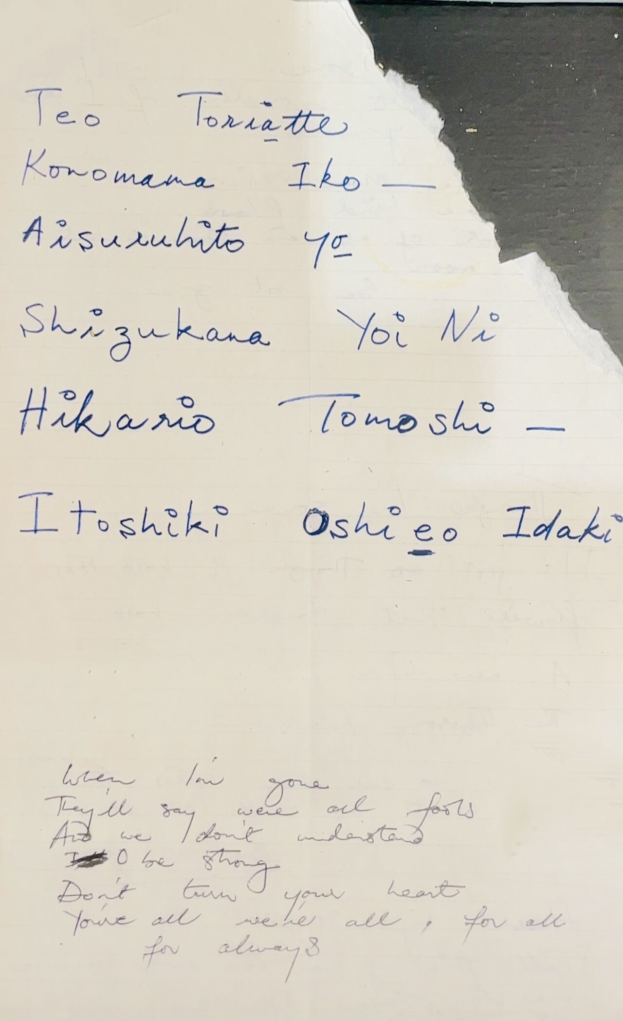 Document
Primary source
Teo Torriatte (Let Us Cling Together) Lyrics
Freddie Mercury


Free account
Read every Freddie Mercury source
Sign up free →
Ready when you are
Start chatting with Freddie Mercury now.
20 messages free · No credit card · Available in 50+ languages.