


Secondary sourceDocument5 November 2011
Timeline of Steve Jobs's Pancreatic Tumor
Mboguski · 5 November 2011
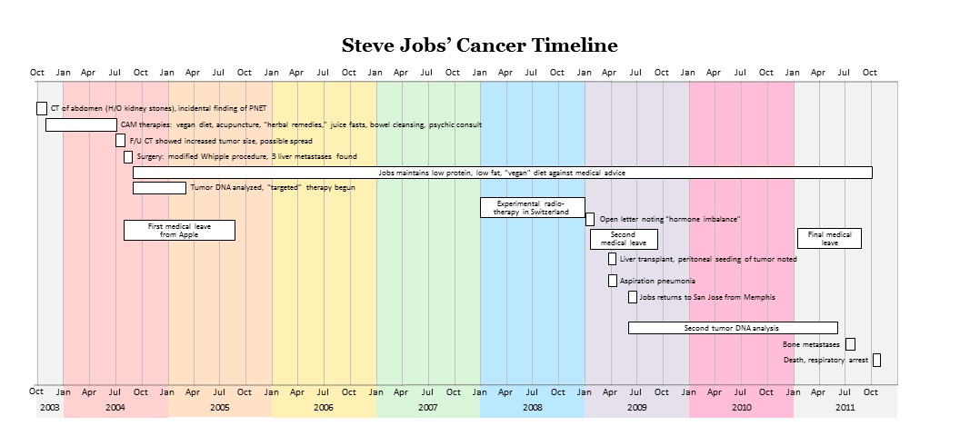
A 2011 infographic that lays out key events in Steve Jobs's pancreatic tumor illness across 2003 to 2011. It is a later summary, not a record made during his lifetime.
It summarizes the course of Steve Jobs's illness in his last years, drawn from a later biography rather than from his own records.
About this source
What it is
This is an infographic titled 'Steve Jobs' Cancer Timeline', made by Mboguski and dated 5 November 2011. It uses horizontal bars and markers across the years 2003 to 2011 to show events such as a CT scan, CAM therapies, surgery, medical leaves, a liver transplant, and death from respiratory arrest. It was prepared by a medical doctor (pathologist) and cancer researcher, based on Walter Isaacson's biography of Jobs.
Why it matters
The timeline shows how Jobs's illness unfolded over several years, which shaped his final period at Apple. Because it is drawn from a biography rather than from medical records or Jobs's own papers, it is a secondary summary. It shows how the public later understood his illness, and it depends on the choices of the biography's author and the infographic's maker.
Look closer
- Which events does the timeline show, and which does it leave out?
- Why might a biographer and a pathologist have chosen to present the illness as a sequence of marked events?
- How would the picture change if you read Jobs's own letters or statements from the same years?
This document is part of the curated material that grounds the AI version of Steve Jobs on Humy.ai — when students ask about related events, the AI can quote it and cite it.







Ready when you are
Start chatting with Steve Jobs now.
20 messages free · No credit card · Available in 50+ languages.